Apple Is Refining Liquid Glass in iOS 27 — Here's What's New
When Apple introduced Liquid Glass as its bold new design language, the response from users and developers was mixed. The translucent, layered aesthetic was visually striking, but many people raised concerns about readability, contrast, and the degree to which content behind glass elements became difficult to parse. Apple has been listening. At WWDC 2026 and in the follow-up Platforms State of the Union session, the company detailed a sweeping set of improvements to Liquid Glass that will ship with iOS 27 — and the changes go much deeper than a cosmetic touch-up.
From a tuned material engine to a brand-new transparency slider in Settings, iOS 27 represents Apple's most significant course correction to Liquid Glass since the design language debuted. Here is a comprehensive look at everything that is changing, why it matters, and what it means for users and developers alike.
What Is Liquid Glass and Why Did It Need Refinement?
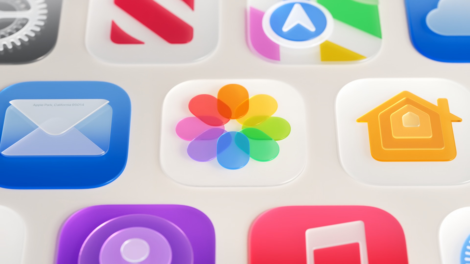
Liquid Glass is the translucent design system Apple introduced to give iOS and its sibling operating systems a more fluid, dimensional appearance. Drawing inspiration from light passing through frosted or curved glass, the language uses blur, refraction, and layered transparency to create a sense of depth across buttons, sidebars, toolbars, and app icons. The effect is intended to make the interface feel alive and physically grounded rather than flat or purely digital.
However, following the initial rollout, users and accessibility advocates highlighted a recurring issue: in certain conditions, the glass effect made text and interface elements harder to read. When wallpapers or dynamic backgrounds were colorful or busy, the content displayed behind Liquid Glass elements could bleed through in distracting ways, reducing legibility. These concerns, gathered through feedback channels and developer community discussions, directly informed the updates Apple is now shipping in iOS 27.
Core Material Changes: Better Diffusion, Depth, and Edge Definition
At the foundation of the iOS 27 Liquid Glass improvements is a retooled approach to how the material handles whatever content sits behind it. Apple has adjusted the underlying rendering so that Liquid Glass more effectively diffuses complex content. In practical terms, this means that a busy wallpaper or a densely packed background will appear softer and less intrusive through a Liquid Glass element, allowing the text or controls sitting on top of the glass to remain clear and readable.
To enhance the sense of depth and make individual Liquid Glass elements feel more visually distinct from their surroundings, Apple has also introduced a darkened edge around these components. Rather than blending seamlessly and sometimes indistinguishably into the background, Liquid Glass elements now carry a subtle dark border that defines their boundary more clearly. Paired with this is an increase in specular highlights — the bright reflective sheen that gives glass its characteristic luminous quality — which adds greater visual separation and makes the material feel richer and more tactile.
Together, these three changes — improved diffusion, darkened edges, and brighter highlights — represent a recalibration of the visual hierarchy that Liquid Glass was always meant to establish but did not always successfully deliver.
The New Transparency Slider: Granular Control for Every User
Perhaps the most user-facing change coming in iOS 27 is the introduction of a transparency slider in the Settings app. This new control allows anyone to dial in exactly how much glass effect appears across the system, moving along a spectrum from ultra-clear transparency all the way to a fully tinted appearance. The slider replaces what was previously a much more limited binary option and gives users meaningful, granular command over their visual experience.
This is a significant quality-of-life addition for a wide range of people. Those who love the full Liquid Glass aesthetic can keep it cranked to maximum transparency. Users who find the effect too distracting or who simply prefer a more opaque, traditional look can push the slider toward the tinted end of the spectrum without entirely abandoning the modern iOS design language. And for users with visual sensitivities or specific accessibility needs, the slider offers an intermediate ground that the old toggle never could.
Automatic Improvements for Existing Apps
One of the most developer-friendly aspects of the iOS 27 Liquid Glass update is how Apple has handled backward compatibility. Apps that already adopted Liquid Glass will receive many of these visual improvements automatically when running on iOS 27, without requiring developers to recompile or submit updated builds. Apple's frameworks will handle the underlying rendering changes at the system level, meaning users will see better-looking, more readable interfaces in their favorite apps simply by updating their device to iOS 27.
This approach reflects Apple's broader philosophy of pushing design improvements through the platform itself, reducing the burden on developers while ensuring a consistent experience across the ecosystem.
Accessibility Integration Remains a Priority
Liquid Glass in iOS 27 also continues to respect and respond to the system's accessibility settings. The material adapts appropriately when users enable Reduce Transparency or Increase Contrast in the Accessibility menu. When Reduce Transparency is active, glass elements shift to more opaque surfaces, eliminating the blur and layering effects entirely in favor of solid backgrounds that are easier to process. When Increase Contrast is enabled, the system boosts the visual differentiation between foreground content and background elements.
Apple's commitment to accessibility integration here is important because it signals that Liquid Glass is not merely a decorative layer but a responsive design system that is designed to work for all users, regardless of visual ability or preference.
What This Means for the Future of iOS Design
The changes Apple is introducing with iOS 27 suggest a maturing of the Liquid Glass design language rather than an abandonment of it. Rather than pulling back from the translucent aesthetic in response to criticism, Apple is doubling down on the concept while engineering away the rough edges that drew complaints. The new transparency slider in particular signals that Apple is willing to give users real agency over how the design language manifests on their devices — a notable shift for a company that has historically been cautious about exposing deep visual customization.
As iOS 27 rolls out to supported devices later this year, these Liquid Glass improvements will become one of the most immediately visible changes for users upgrading from earlier versions. Whether you have been a fan of the aesthetic from the beginning or have been waiting for Apple to address its shortcomings, iOS 27 appears poised to deliver a version of Liquid Glass that works better, reads more clearly, and adapts more gracefully to the full diversity of iPhone users.